

Preview
Publication Date
Spring 2022
Design
We’ve seen enough green. The environmentally friendly movement has been marked by the steady inclusion of pleasant greens and catchy phrases and easy-to-read infographics into our everyday media. Does this accurately represent the issues our species and our planet are facing? Our team thinks not.
We’ve set out to create a design that incorporates a few key ideas:
1) The design must be gender-neutral: We want this design to be as inclusive as possible when it comes to form. The climate crisis doesn’t only affect some of us, it affects all of us, whether we like it or not. Sooner or later, it reaches even the most privileged among us.
2) The design must be timeless: The current climate issues didn’t arise overnight and there’s no quick and easy solution to fix it. With a mix of ancient Roman, renaissance European, futuristic, and modern accents, we hope to communicate the timeless nature of the environmental activism movement. These issues belonged to our forefathers (who did little to help) and now they belong to us. We have a choice to make in order to save our own children from the burden of the climate crisis, and it is only action in the present that will allow us to do so.
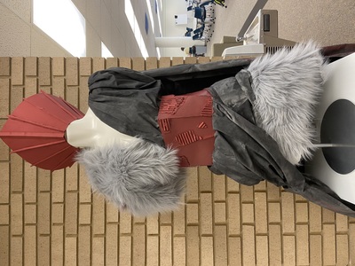
3) he design must not be green: As we’ve said, we have seen enough green. The reality of the climate crisis is marked more by the loss of green than by the artificial spread of it. Using nuclear sky reds and burnt forest blacks, we hope to communicate the true nature of these issues in a shocking, and perhaps uncomfortable way. These colors are also used to exemplify anarchy, a nod to the fact that we cannot rely on governments or organizations to have our best interests at heart, and must take our survival into our own hands.
4) he design must communicate the “warlike” turn our efforts must take: The incorporation of the Roman soldier-esque elements, viking-like pelts, and bracers communicate the inherently warlike nature of the struggle against climate change. It is sometimes speculated that the third world war will be fought over water, and in some areas of the world, we’re already seeing this come into effect. The fight against climate isn’t us against some vague notion of pollution, it is us against polluters and the corporations and organizations that allow these crimes against nature and humanity to continue on a horrific scale.
We believe our final design accomplishes all of these goals, as well as forming a deity-like figure to represent them. The (perhaps ironic) use of the halo headdress and sweeping fabrics give a sense of twisted holiness to the final product, creating a sense of simultaneous power and corruption. For materials, we’ve incorporated cardboard from cereal boxes, plastic from used milk jugs, metal from used cans, faux fur from an old rug, fabric from a repurposed sheet (that had been intended to be thrown out, originally), and even glass from recycled bottles. Every material, save for the paint and glue, is recycled or repurposed. With these intentions and creative methods, we hope to be able to present a final garment that will be functional, fashionable, and impactful.
Team Members
- Damien Calhoun -- English and Technical Communication
- Zachary Sutton -- Computer Science
- Paige Hornburger -- English Secondary Education
- Elaine Pohlsander -- English Secondary Education
Prize Awarded
1st Place

Images
Additional views of the clothing